Usability Test Report
Oregon State Parks Reservation Website
Image via Oregon State Parks
Skills & Competencies
Usability Testing & Research
Task Design & Test Planning
Data Synthesis & Analysis
UX Writing & Clarity Testing
Information Architecture
Research Communication
About This Project
This project evaluated the Oregon State Parks Reservation website to see how easily users could search, filter, and book campsites, cabins, and yurts.
The test revealed that while the site functions reliably, its usability issues—especially around the calendar, filters, and labeling—made booking slower and more frustrating than it should be.
Context & Purpose
The goal of this project was to understand how real users interact with the Oregon State Parks reservation system and identify barriers to efficient, confident bookings.
The study aimed to:
- Evaluate the ease of navigation, labeling, and search filters.
- Observe how users interpret availability calendars and icons.
- Measure task completion success and time on task.
- Provide clear, evidence-based recommendations for usability improvements.
- The project’s findings highlight how small interface issues—like unclear icons and missing feedback—can make an otherwise functional government website feel outdated and unintuitive.
Image via stateparks.oregon.gov
Process & Methods
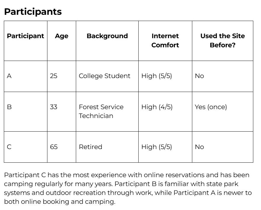
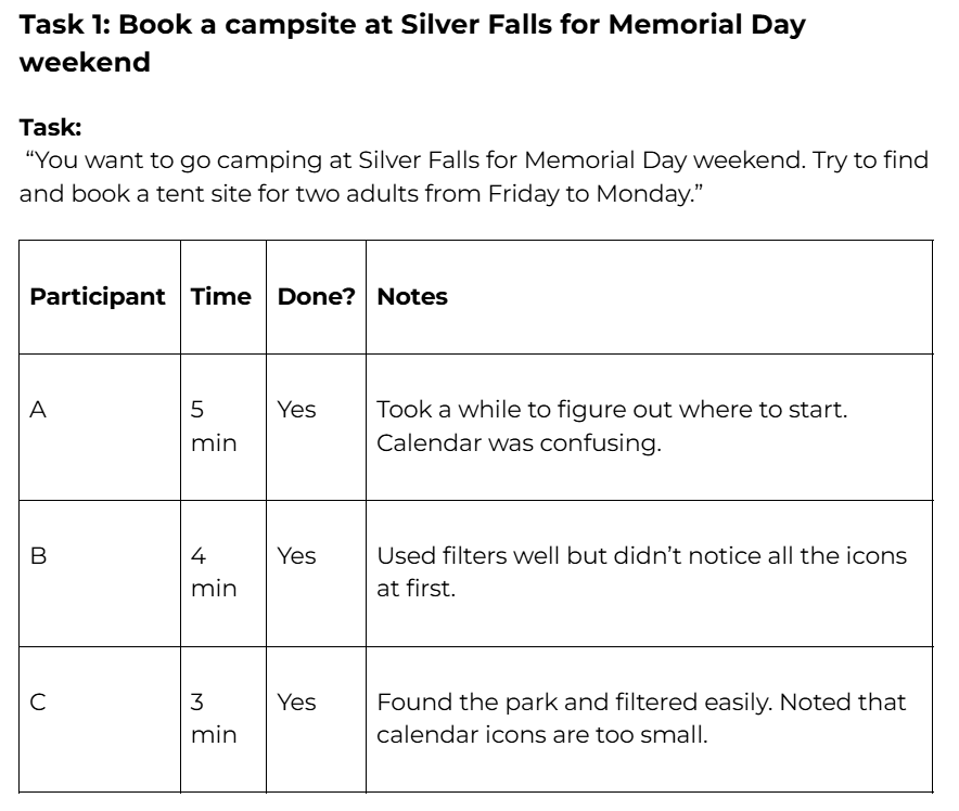
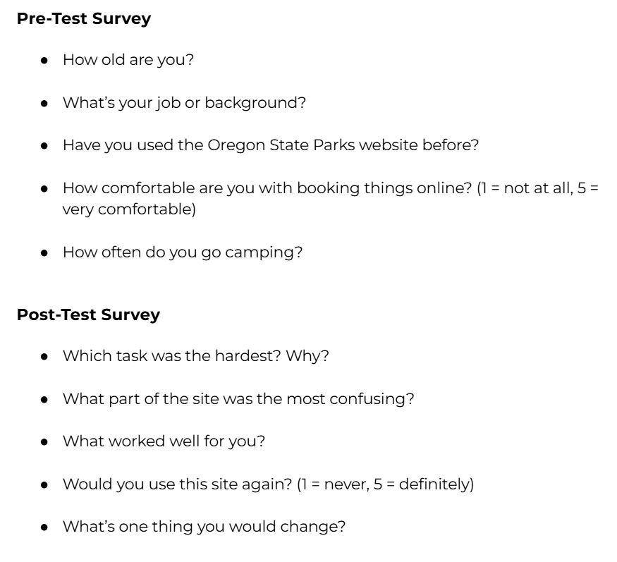
The study used remote usability testing with three participants over Zoom. Each participant completed three structured booking tasks representing common user goals: reserving a campsite, finding a pet-friendly cabin, and checking yurt availability.
Participants were encouraged to speak aloud as they navigated the site, describing what they saw and what confused them. I recorded completion times, observed behaviors, and collected pre- and post-test surveys to capture both quantitative and qualitative insights.
Steps:
- Designed realistic task scenarios for campsite, cabin, and yurt booking.
- Conducted three think-aloud test sessions via Zoom.
- Recorded task completion rates, times, and user feedback.
- Synthesized recurring usability issues related to the calendar, filters, and site labeling.
- Developed five key recommendations to improve clarity, consistency, and overall task flow.
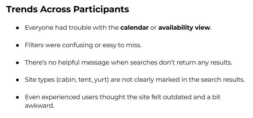
Findings
The usability test revealed several recurring issues affecting how users search for and reserve sites on the Oregon State Parks reservation website. While participants were able to complete most tasks, every session involved confusion or unnecessary effort due to unclear labeling, inconsistent feedback, and clunky navigation.
Key Findings:
- Confusing calendar and icons made it hard for users to interpret availability. Symbols like “A” and “R” were unclear, and color indicators lacked a visible key.
- Buried or unclear filters—particularly for site type and “pet-friendly” options—caused users to overlook important criteria.
- Missing feedback messages left users unsure why searches returned no results or whether filters were applied correctly.
- Unclear site labeling forced users to click into listings to determine whether they were viewing a tent site, cabin, or yurt.
- Filters reset unexpectedly when users changed dates or navigated between months, creating frustration and extra steps.
Insights:
- Simplifying the calendar interface and improving icon clarity would make availability easier to scan at a glance.
- Reorganizing filters and adding persistent options would reduce repetitive effort and improve flow between searches.
- Adding “no results” messages and visible filter confirmation would make the experience feel more responsive and trustworthy.
- Consistent, bold site type labels (e.g., “CABIN,” “YURT”) would improve recognition and reduce guesswork.
Recommendations
The usability test showed that while people can book campsites on the Oregon State Parks website, it’s harder than it needs to be. Across all three tasks—booking a site, finding a pet-friendly cabin, and checking yurt availability—participants ran into the same problems: confusing calendars, hidden filters, and missing feedback. Even users familiar with online booking said the site felt clunky and outdated.
01
Make the Calendar Easier to Read
Every participant struggled to understand the tiny icons and color codes on the calendar. Adding a simple legend or hover labels would help people know what each symbol means so they can pick dates with confidence.
02
Move Important Filters Up Front
Filters like “pet-friendly” and “site type” were hidden deep in the menu. Moving them higher on the page—and making them stand out visually—would help users find what they need faster without extra clicks or confusion.
03
Show a Message When No Results Appear
When filters didn’t return anything, users just saw a blank screen. A short, friendly message like “No matches found—try changing your filters” would give them feedback and make the site feel more responsive.
04
Label Site Types Clearly
Users shouldn’t have to click into every listing to see if it’s a cabin, yurt, or tent site. Adding bold, consistent labels (like CABIN or YURT) right in the search results would make browsing quicker and way less frustrating.
Reflection
This test showed that the Oregon State Parks reservation site works, but it’s not very easy to use—especially if you’re trying to do something fast.
Even participants who had booked trips online before said the site was clunky. The biggest issues were the calendar, filters, and how results are shown. A few simple fixes would make the site way more user-friendly.
Related Projects